If your blog looks messy or hard to read, don’t be surprised if people bail after the first paragraph. Fonts do way more than just display words—they totally shape how visitors feel about your content, and frankly, whether they’ll stick around for that second cup of coffee.
Most big-name blogs don’t mess around with wild fonts. In fact, there’s a short list of tried-and-true fonts you’ll spot again and again. You’ll see a lot of Open Sans, Roboto, and Lato on sites like Medium and WordPress. Why? They’re super easy on the eyes and look clean on every device. Most blogging platforms actually recommend these fonts in their default options for a reason: they just work.
Your font choice isn’t just about looks—it’s also about loading speed, mobile friendliness, and even how trustworthy your blog feels. Do a quick scroll through popular blogs, and you’ll see how consistently they stick to simple, readable fonts. Even Google’s own blogs rarely stray from Roboto or Arial. There’s a reason the best never get fancy.
- Why Blog Fonts Matter
- Most Popular Fonts Used on Major Blogging Platforms
- Font Pairing: Making Headlines and Body Text Work Together
- Tips for Picking the Right Font for Your Blog
- Common Font Mistakes to Avoid
- Simple Steps to Change Fonts on Popular Blogging Platforms
Why Blog Fonts Matter
Ever clicked on a blog and just couldn’t get past the first line? Odds are, the font had something to do with it. The blog fonts you pick set the tone, control readability, and send strong signals about your site’s style and credibility.
If people find your site hard to read, they bounce—fast. According to a Google study, visitors form a first impression of a website in under 50 milliseconds. That means your font gets judged way before readers even process what you wrote. Clean, familiar fonts like Open Sans or Roboto build trust, while anything too flashy or tight may get ignored.
It’s not just a feeling—easy-to-read blog fonts improve how much info people actually take in. Research from Wichita State University showed that simple, sans-serif fonts such as Arial and Verdana let users scan and absorb content up to 15% faster than fancy or serif-heavy fonts.
Mobile browsing is huge—over 60% of blog traffic comes from phones these days. If your font is hard to read on a small screen, you’ve lost half your audience before you can say “bounce rate.” That’s why most best blogging platforms now come pre-loaded with mobile-friendly font choices that look great on any screen size.
When you pay attention to font choices, you don’t just make your blog look good. You help people stay longer, read more, and maybe even come back for another visit. Picking the right blog fonts isn’t just a design issue—it’s crucial for your blog’s success, and honestly, it’s one of the easiest wins if you want more engagement.
Most Popular Fonts Used on Major Blogging Platforms
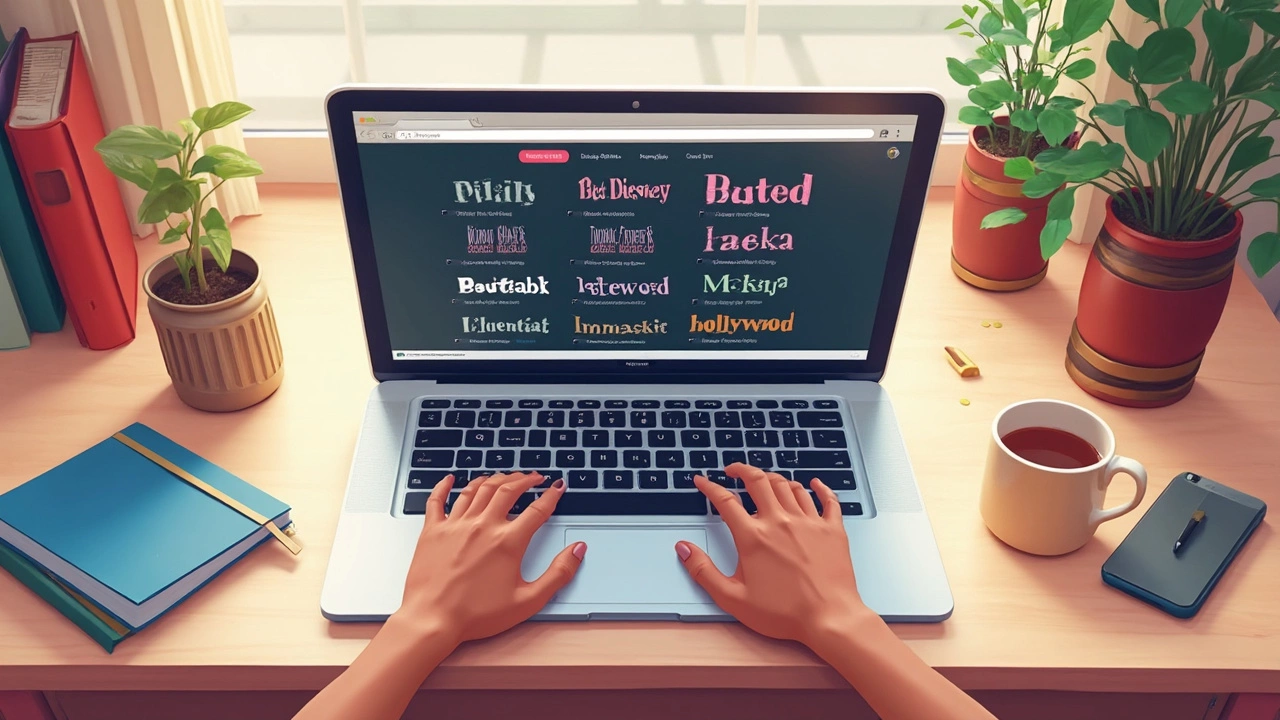
If you check out the biggest blogging platforms—WordPress, Blogger, Medium, and Wix—there’s a clear trend. Most of them default to a short list of safe, super-readable fonts. You won’t see Comic Sans or Curlz anywhere. Instead, the stars of the show are sans-serif fonts that keep things clean and easy to skim.
Here are the blog fonts you’ll run into the most:
- Open Sans: Big with WordPress blogs. It’s simple, modern, and doesn’t grab more attention than your actual content.
- Roboto: Google’s favorite. Blogger and Medium both use Roboto, and lots of tech blogs do the same. It scales well and works across pretty much every device.
- Lato: Popular among design-savvy bloggers. It looks a bit friendlier than Arial or Helvetica but still feels professional.
- Arial and Helvetica: Old-school but widely used. These come in handy if you want something foolproof and boring-in-a-good-way. Easy to read, even if you’re squinting.
- Georgia: For folks who want a serif vibe but don’t want to go full Times New Roman. Medium uses Georgia for headings every so often.
To give you a sense of how platforms actually break down, check out this snapshot of their default fonts in early 2025:
| Platform | Default Font | Font Type |
|---|---|---|
| WordPress.com | Open Sans | Sans-serif |
| Medium | Charter (headlines), Georgia (body) | Serif |
| Blogger | Roboto | Sans-serif |
| Wix | Arial (can customize) | Sans-serif |
If you’re just starting out, don’t overthink it. These fonts are popular for a reason—they work everywhere, load fast, and make your writing easy to read. Don’t worry about standing out with a wild font unless you’re launching an art or design blog. Instead, grab one of these proven options and focus on your content.
Font Pairing: Making Headlines and Body Text Work Together
Ever wonder why some blogs just look pro while others feel a bit off, even if they use the same blog fonts? It usually comes down to smart font pairing. The font you pick for your headlines should get people’s attention, but your body text font needs to be super readable, especially on mobile.
The trick is to create contrast without causing clashes. For example, pairing a bold, modern headline font like Montserrat with a simple body font like Open Sans keeps things easy to scan. If you want that classic blog look, try pairing Georgia (for headlines) with Arial or Verdana (for text). This combo pops up a lot on food and travel blogs.
Here are some popular and proven font pairs bloggers use to keep their posts looking sharp:
- Roboto Slab for headlines + Roboto for body text (perfect for tech or how-to blogs)
- Lora (headline) + Open Sans (body) – shows up often on lifestyle and personal journals
- Merriweather (headline) + Lato (body) – great if you love a touch of personality but want something easy to read
When you’re pairing fonts, keep these quick tips in mind:
- Limit yourself to two fonts max: too many styles and your blog readability tanks fast.
- Make sure your headline font is noticeably different—either bolder, wider, or more decorative.
- Stick with fonts known to work well together. Many font libraries (like Google Fonts) show popular pairing suggestions.
- Always check how your font combo looks on both desktop and mobile before going live.
One survey from Medium showed that users spent 25% more time on stories with visually clear headlines and readable body fonts. Bottom line: nailing your font pairing isn’t just about looks. It’s a quick win for better engagement on any best blogging platform.
Tips for Picking the Right Font for Your Blog
Picking a font for your blog isn’t about grabbing whatever looks cool in the dropdown. It can mess with your blog readability and crash your bounce rates if you get it wrong. Here’s how to make smart, simple choices that fit your goals.
- Stick to Sans-Serif Fonts for Most Blogs: Fonts like Open Sans, Roboto, and Lato are everywhere for a reason. Sans-serif fonts look clean, especially on screens, which is what most folks use to read blogs.
- Size Matters: For blog posts, set your main font between 16px and 18px. Bigger isn’t always better, but tiny fonts make people squint, and that’s bad news for retention. Subheadings should pop slightly more—think 20px or above for contrast.
- Limit Your Fonts: Using more than two font types on your site almost always looks messy. Stick to one for headlines and one for body text. If you want to play it extra safe, use different weights (Bold, Regular, Light) of the same font family.
- Check on Different Devices: What looks great on your laptop might look brutal on a phone. Blog traffic is mostly mobile now—over 60% according to Statista in 2024—so check your site on both small and big screens before locking in your choices.
- Watch Your Line Spacing: Spacing, or "line height," should be about 1.4 to 1.6 times the font size. This helps people read without losing their place. If text looks jammed up, crank up the line height in your blog’s style settings.
Bold, heavy headline fonts with easy-to-read body text do well on almost every blog design. Check out this quick look at what some top blogs use:
| Blog Platform | Headline Font | Body Font |
|---|---|---|
| Medium | Charter | Charter |
| WordPress.com (Default Themes) | Lato | Open Sans |
| Blogger | Georgia | Arial |
Bottom line: Prioritize readability, keep things simple, and test your site across devices. If your text is easy on the eyes, you’re already ahead of most new bloggers.
Common Font Mistakes to Avoid
You’ve picked a solid topic. Your design is clean. But one wrong font choice can ruin all your hard work. Here’s where most bloggers slip up with blog fonts and mess up readability and even their site’s look on Google Search.
- Using Too Many Fonts: Mixing multiple fonts on your blog can make things look messy. Stick to two fonts—one for headlines, one for body text. That’s what big sites like Medium and TechCrunch do.
- Poor Font Size Choices: If your text is too small (think 12px or less), folks on mobile are going to squint—and probably bounce. Best practice? Headlines around 32px and body text between 16px and 18px.
- Bad Contrast: Gray text on a white background might seem cool, but it’s murder on your readers’ eyes. Black text on white backgrounds is the most readable combo, and Google’s accessibility guidelines back that up.
- Ignoring Line Spacing: Lines that are crammed close together (less than 1.5 line height) are hard to scan and annoy readers. Give your words room to breathe.
- Going Wild with Decorative Fonts: Script or handwritten fonts might look fancy but they’re a pain to read in big chunks. Keep those for logos, not blog posts.
If you want some quick proof that best fonts for blogs matter, check out this bit of data from Smashing Magazine (a well-respected design site):
| Font Size (px) | Bounce Rate |
|---|---|
| 14 | 42% |
| 16 | 37% |
| 18 | 28% |
Notice how bounce rate drops when the text gets easier to read? That’s a direct impact on how long folks stay on your site. Don’t let bad font choices send your hard-earned traffic packing. Nail the basics, and your blog readability goes way up.
Simple Steps to Change Fonts on Popular Blogging Platforms
If you want your blog to feel fresh and actually get read, switching fonts isn’t just easy—it’s essential. The steps you need to take will depend on what blogging platform you use. Here’s a real-world breakdown for the top players right now.
WordPress (the self-hosted kind):
- Head to your dashboard and open "Appearance" > "Customize."
- Select "Typography" or "Fonts" (the exact wording depends on your theme).
- Choose from the drop-down. Most themes give you Google Fonts like Roboto and Lato ready to roll. Just hit "Publish."
WordPress.com (hosted version):
- Go to "Design" > "Customize" > "Fonts."
- Pick your headline and body font. Preview changes instantly.
- Save and boom—you’re done.
Blogger (Google’s free platform):
- Open "Theme" and click the "+" under "Customize."
- Click on "Advanced."
- Find "Page Text" and "Titles"—you can pick from Google Fonts.
- Save and check your blog live to see the changes.
Medium: You’re kinda limited here. Medium uses its own default font stack (think Charter, Georgia, and Arial) for consistency. The only way to change fonts is by adding custom code to your story, but 99% of writers just roll with the defaults.
Squarespace:
- From the Home Menu, choose "Design" > "Site Styles."
- Scroll to the “Fonts” section.
- Pick from built-in packs or customize headline/body fonts separately. They have plenty of web-safe and Google Fonts.
- Changes are live as you go—no need to refresh a hundred times.
Wix:
- On the Editor, select the text element you want to style.
- Hit “Edit Text” and then “Fonts.”
- Pick from Wix’s pretty big library—lots of Google Fonts and custom options.
- You can do this for headings, paragraphs, even buttons. Don’t forget to save!
Here’s a quick snapshot of built-in font support by platform:
| Platform | Default Font Options | Supports Google Fonts? |
|---|---|---|
| WordPress | Lots (theme-dependent) | Yes |
| Blogger | Basic, but customizable | Yes |
| Medium | Mostly fixed stack | No (without hacks) |
| Squarespace | Many packs + custom | Yes |
| Wix | Large choice | Yes |
If SEO is your game, always pick blog fonts that are fast to load and easy to read across devices. Once you change your font, preview on different screens (desktop, tablet, phone) to make sure everything looks smooth. One last tip: don’t go wild switching fonts every month—it confuses readers and can mess up your brand’s look.


Written by Arjun Mitra
I am an IT consultant with a keen interest in writing about the evolution of websites and blogs in India. My focus is on how digital spaces are reshaping content creation and consumption. I aim to provide insights and strategies for those looking to thrive in the digital landscape.
All posts: Arjun Mitra