
Layout Pattern Selector
Find Your Perfect Layout Pattern
Select the content type and primary goal for your page. We'll recommend the best layout pattern based on your needs.
Key Takeaways
- Start with a clear purpose and user flow before sketching any design.
- Use a grid system to keep spacing consistent and to simplify responsive adjustments.
- Apply visual hierarchy - size, color, and placement - to guide eyes toward the most important content.
- Choose a layout pattern (F‑layout, Z‑pattern, card‑based, etc.) that matches your content type.
- Test on multiple devices and iterate based on real user feedback.
When you hear the phrase website layout is the overall arrangement of elements on a web page, including headers, navigation, content blocks, and footers, it often sounds abstract. In reality, a solid layout is the foundation that turns a pile of text and images into a clear, persuasive experience. This guide walks you through the mental models, tools, and step‑by‑step actions you need to create a layout that feels intuitive on a desktop screen and still works on a phone.
Understand Core Layout Principles
Before you drag any box onto a canvas, get comfortable with three building blocks that every designer leans on:
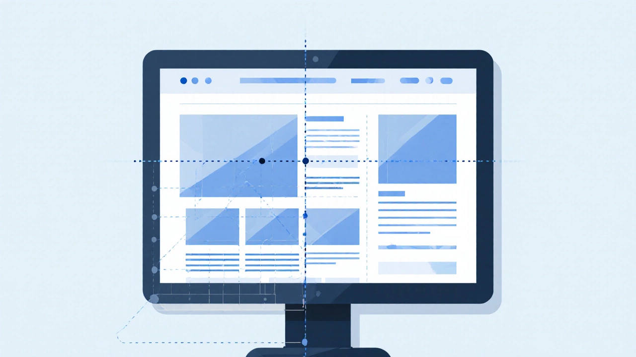
- Grid system is a framework of rows and columns that creates consistent spacing and alignment across a page. Grids keep your design tidy and make it easier to adapt to different screen sizes.
- Visual hierarchy is the order in which the eye perceives elements, driven by size, contrast, color, and placement. Without hierarchy, users wander aimlessly and miss key messages.
- F‑layout is a pattern where users scan the page in a horizontal‑then‑vertical "F" shape, common for text‑heavy sites. Knowing this helps you place headlines and call‑to‑actions where eyes naturally linger.
Every good layout balances these three. For example, a blog might rely heavily on the F‑layout, while an e‑commerce homepage could benefit from a card‑based grid that showcases multiple products at once.
Popular Layout Patterns - When to Use Which
Designers rarely start from scratch; they pick a pattern that matches the content goal. Below is a quick comparison of the four most common patterns.
| Pattern | Best For | Typical Structure | Strengths | Weaknesses |
|---|---|---|---|---|
| F‑layout | Long articles, news sites | Header → Wide content column → Narrow sidebar | Matches natural eye flow, easy to read | Poor for visual‑heavy pages |
| Z‑pattern | Landing pages, single‑product promos | Header → Hero image → CTA → Footer | Guides users to a single action | Limited space for multiple messages |
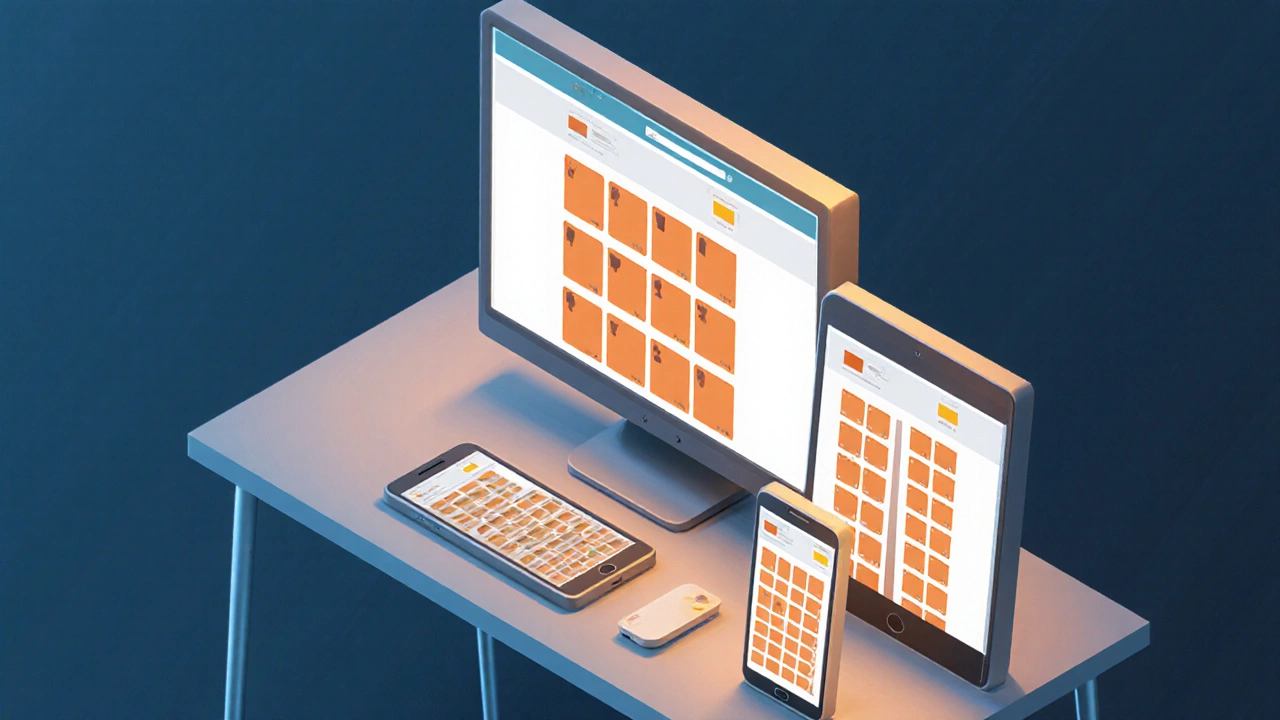
| Card‑based grid | E‑commerce, portfolio galleries | Rows of equal‑sized cards | Scalable, works well on all devices | Can feel repetitive if not varied |
| Single‑column (mobile‑first) | Blogs, mobile apps | Stacked vertically, full‑width sections | Simple, fast loading | May waste horizontal space on large screens |
Pick a pattern that matches the primary user goal. If your site’s main job is to get visitors to read a story, stick with the F‑layout. If you’re selling a single product, the Z‑pattern can funnel attention right to the "Buy" button.
Step‑by‑Step Process to Design Your Layout
- Define the purpose. Write a one‑sentence mission for the page. Example: "Showcase the new smartwatch’s features and drive pre‑orders."
- Map user flow. Sketch a simple diagram of how a visitor should move from entry point to conversion. Include key touch points like navigation, hero section, and form.
- Create a sitemap. List all pages and their hierarchy. A clear sitemap prevents over‑stuffed navigation menus later.
- Build low‑fidelity wireframe is a basic blueprint that shows placement of major elements without design details. Use paper, whiteboard, or a tool like Figma. Focus on the chosen pattern (e.g., place the headline in the top‑left of the F‑layout).
- Apply a grid. Choose a 12‑column grid for desktop and a single column for mobile. Align all blocks to the grid to keep margins even.
- Design the navigation menu is the set of links that let users move between sections or pages. Keep it horizontal on wide screens, collapse into a hamburger icon on small devices.
- Populate with real content. Replace placeholder text with actual headlines, images, and calls‑to‑action. This reveals spacing issues early.
- Test responsiveness. Resize the browser or use device simulators. Ensure the grid rearranges gracefully and the hierarchy stays clear.
- Gather feedback. Share the prototype with a few target users. Ask where they look first, what confuses them, and whether they can accomplish the goal.
- Iterate. Adjust spacing, reorder sections, or switch patterns if feedback suggests a better flow.
Following these steps keeps the process logical and prevents you from getting stuck tweaking colors before the structure is solid.
Responsive Design - Making the Layout Fluid
A layout that looks perfect on a 24‑inch monitor will break on a 6‑inch phone if you ignore responsive principles. Here’s a quick cheat‑sheet:
- Responsive design is the practice of creating layouts that adapt to different screen sizes using flexible grids, images, and CSS media queries.
- Start with a mobile‑first approach: design the single‑column layout first, then add columns for larger screens.
- Use relative units (%, vw, rem) instead of fixed pixels for widths and margins.
- Set max‑width on images (e.g.,
max-width: 100%;) so they shrink gracefully. - Define breakpoints at common device widths: 480px, 768px, 1024px, 1440px.
When you implement these rules, the same grid you built for desktop can collapse into fewer columns, preserving vertical hierarchy without extra effort.
Common Mistakes to Avoid
- Overloading the hero. A massive carousel with five slides distracts users. Keep the hero focused on one clear message and CTA.
- Neglecting whitespace. Cramped text forces eyes to work harder. Let the grid dictate generous breathing room.
- Inconsistent navigation. Changing the menu style across pages confuses users. Keep the navigation menu uniform.
- Forgetting the footer. The footer is a trusted spot for contact info, privacy links, and secondary navigation. An empty footer feels unfinished.
- Ignoring accessibility. Ensure contrast ratios meet WCAG AA, add alt text to images, and make focus states visible.
Final Layout Checklist
- Purpose statement written and visible on the page.
- Chosen layout pattern matches content goal.
- All major sections align to the grid.
- Visual hierarchy guides the eye to the primary CTA.
- Navigation menu is clear, consistent, and mobile‑friendly.
- Images and media scale with
max-width:100%. - Breakpoint testing completed on at least three device sizes.
- Accessibility checks (contrast, alt text, keyboard navigation) passed.
- Feedback from at least three real users incorporated.
Frequently Asked Questions
What is the difference between a grid system and a layout pattern?
A grid system is the underlying set of rows and columns that keeps spacing consistent. A layout pattern (like F‑layout or Z‑pattern) is how you place content within that grid to match user eye‑movement.
Do I need a separate layout for mobile and desktop?
Not a completely new design, but you should adapt the same layout using responsive techniques-collapse columns, reorder sections, and enlarge tap targets.
How many columns should my grid have?
For most desktop sites a 12‑column grid works well; it offers flexibility for halves, thirds, and quarters. Mobile screens often switch to a single column.
Can I mix layout patterns on a single page?
Yes, but keep it intentional. For example, an F‑layout for the main article and a card‑grid for related posts at the bottom works if the transition feels natural.
What tools are best for creating wireframes?
Free options include Figma, Adobe XD, and Pencil Project. For rapid sketches, even paper and a pen work-just transfer the core layout to a digital tool later.


Written by Arjun Mitra
I am an IT consultant with a keen interest in writing about the evolution of websites and blogs in India. My focus is on how digital spaces are reshaping content creation and consumption. I aim to provide insights and strategies for those looking to thrive in the digital landscape.
All posts: Arjun Mitra